Character Profiles
A collection of custom Toyhouse character layouts created with pure HTML and inline styling, designed to be aesthetic, readable, and responsive.

These are custom character profile layouts I built entirely using HTML and inline CSS within Toyhouse’s limited editor. Because Toyhouse restricts external CSS, scripts, and custom file structures, each layout required careful problem-solving to achieve the desired look and interactivity. I focused on readability, themed aesthetics, and creative layouts despite the constraints. These designs have been used by many other Toyhouse users and helped grow my interest in UI and front-end design.
All of the descriptions were taken directly from their respective Toyhouse pages, so forgive the less than formal language.
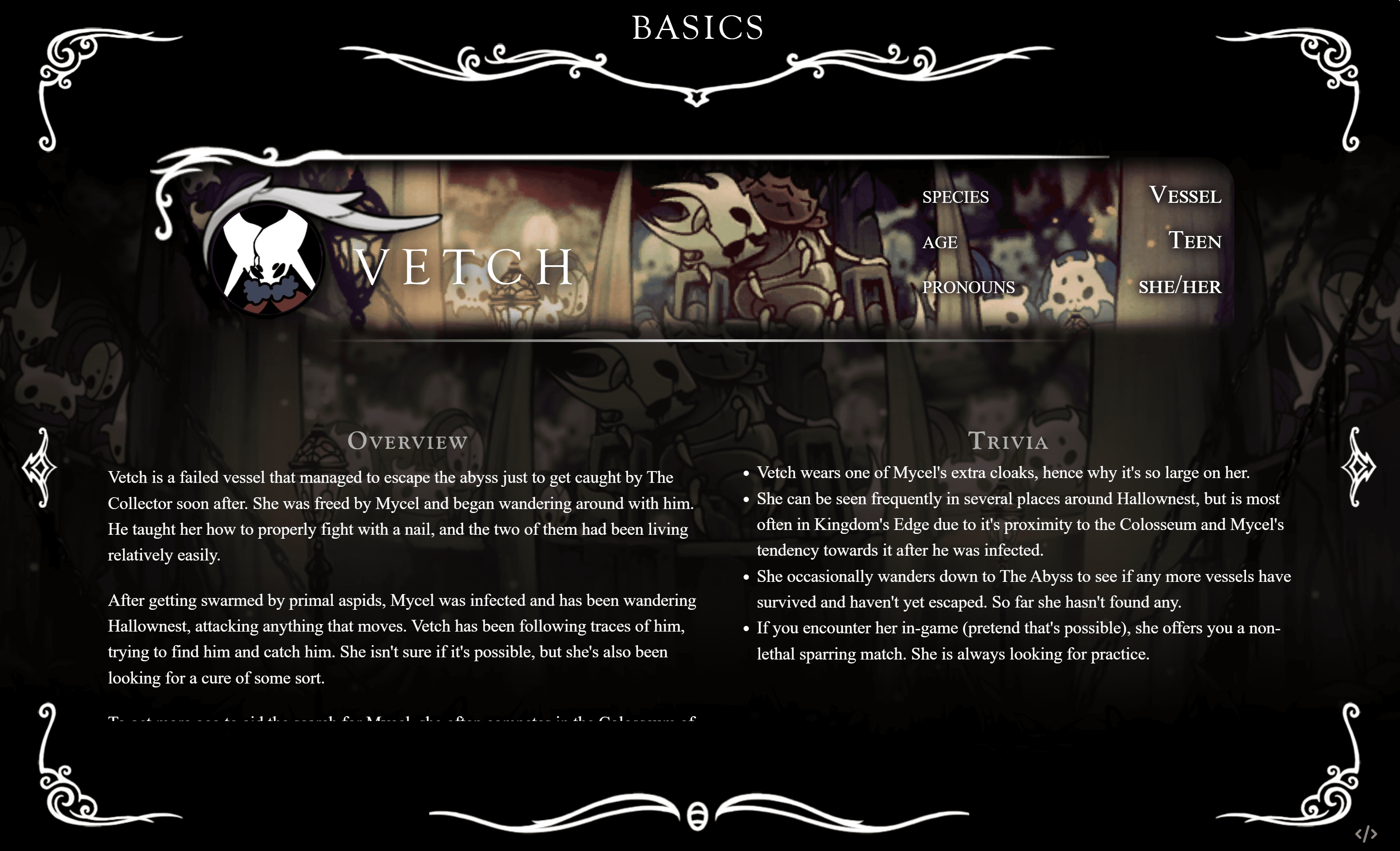
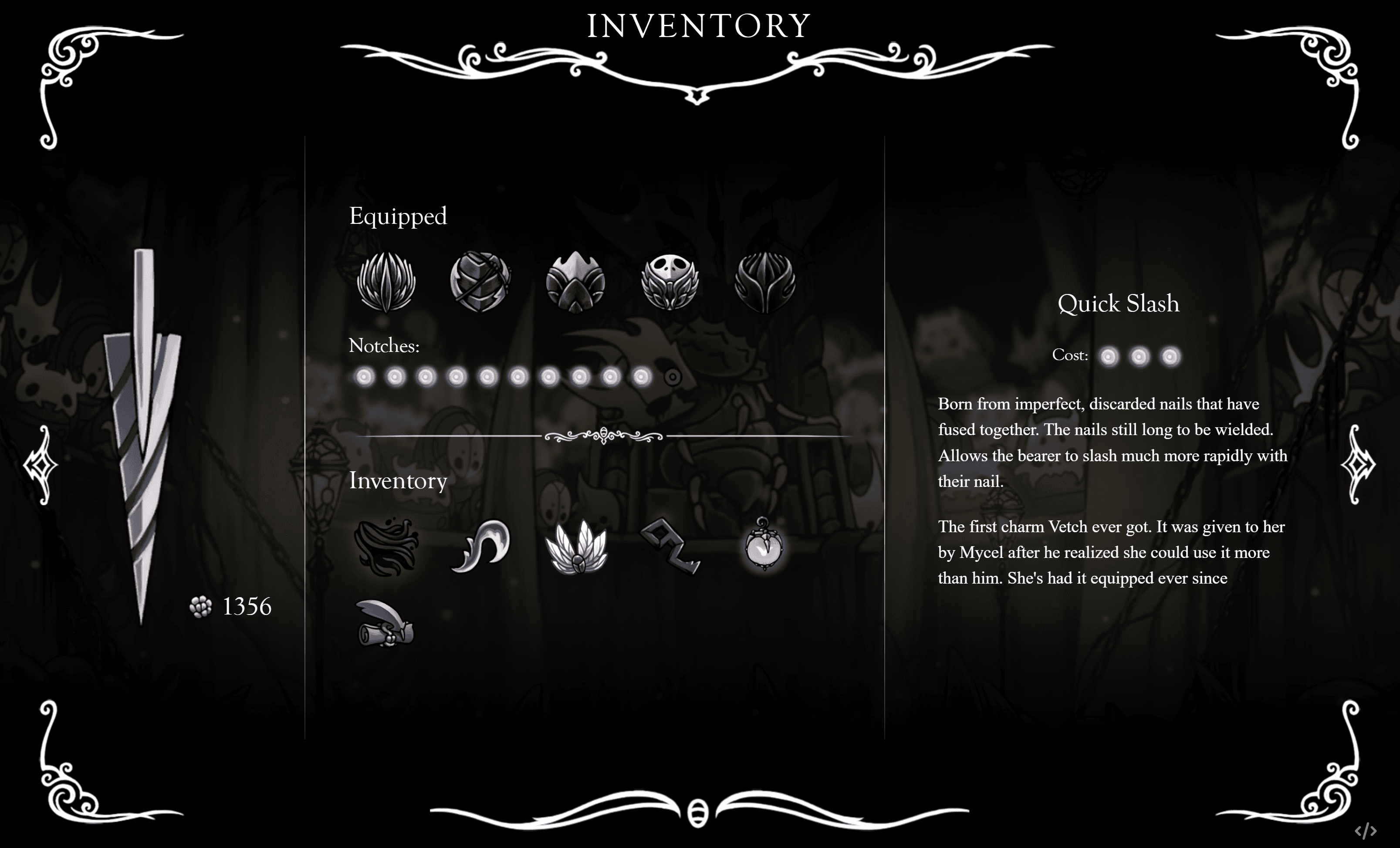
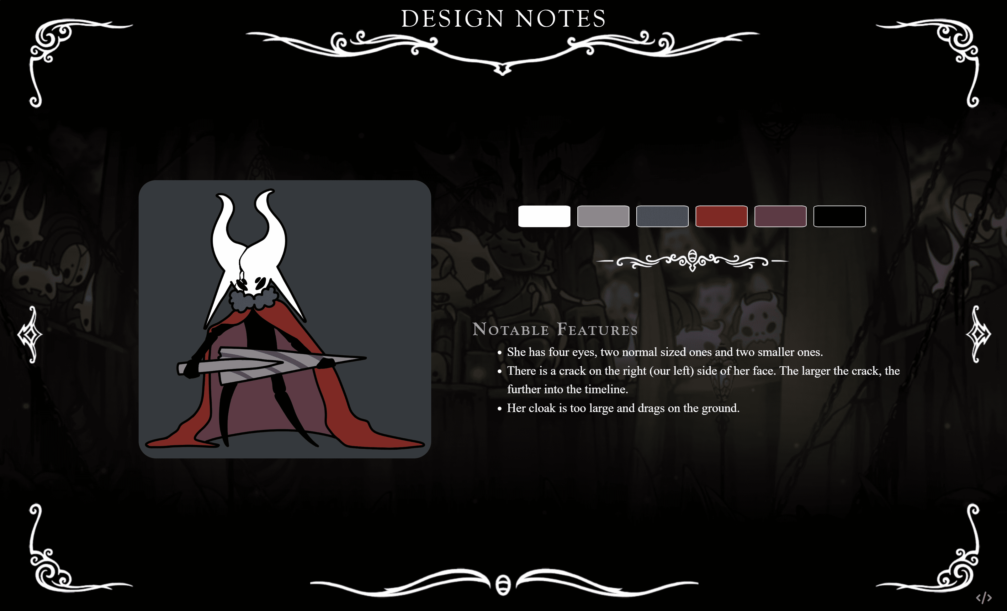
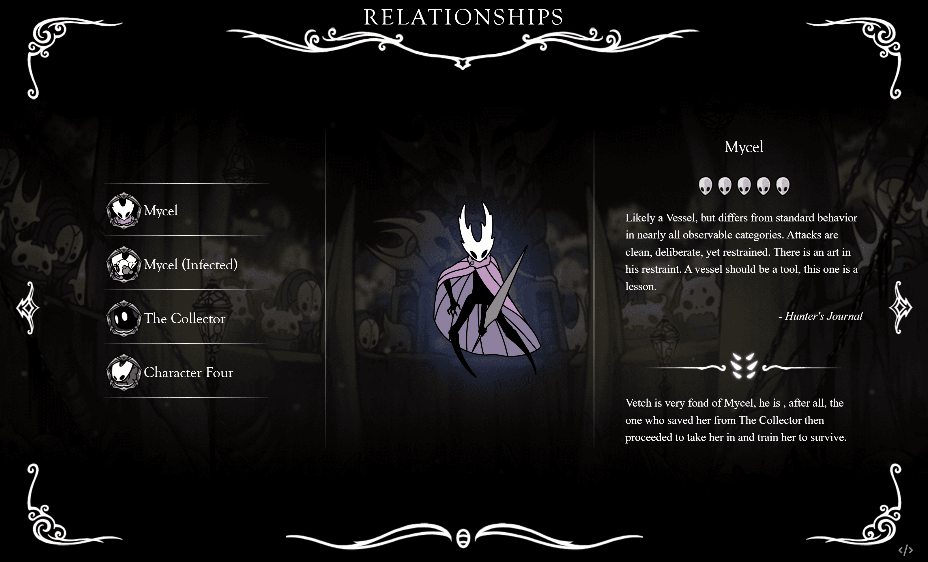
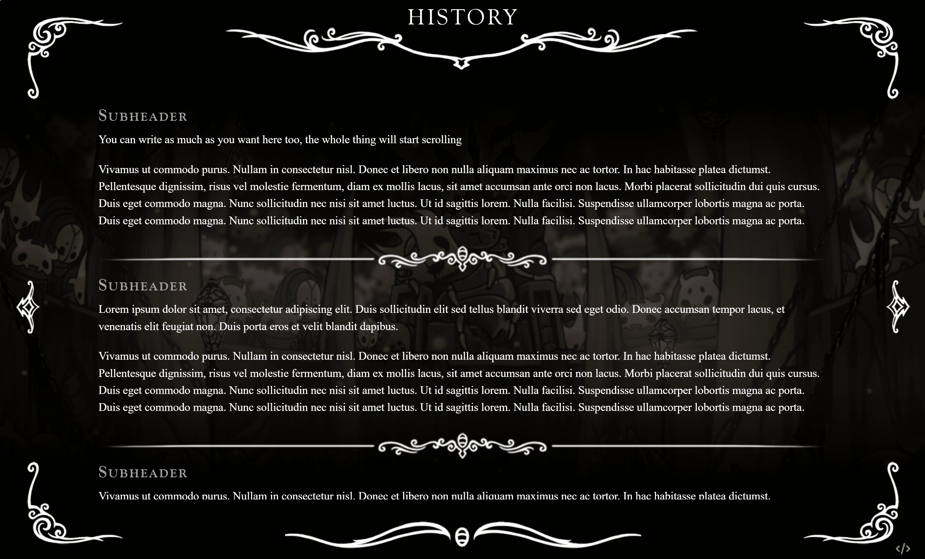
I made some Hollow Knight characters! then got bored and decided they needed themed profiles. So here's a Hollow Knight themed character profile code!
It has pages for basics, inventory, design notes, relationships, and history, so pretty much all you could need
This is the first code that I've actually posted on here (which is crazy, im a computer science major), so I hope it's easy enough to edit. There's comments throughout the code, but let me know if you have any questions!
625
Jun 4, 2025
Forest
Interactive version
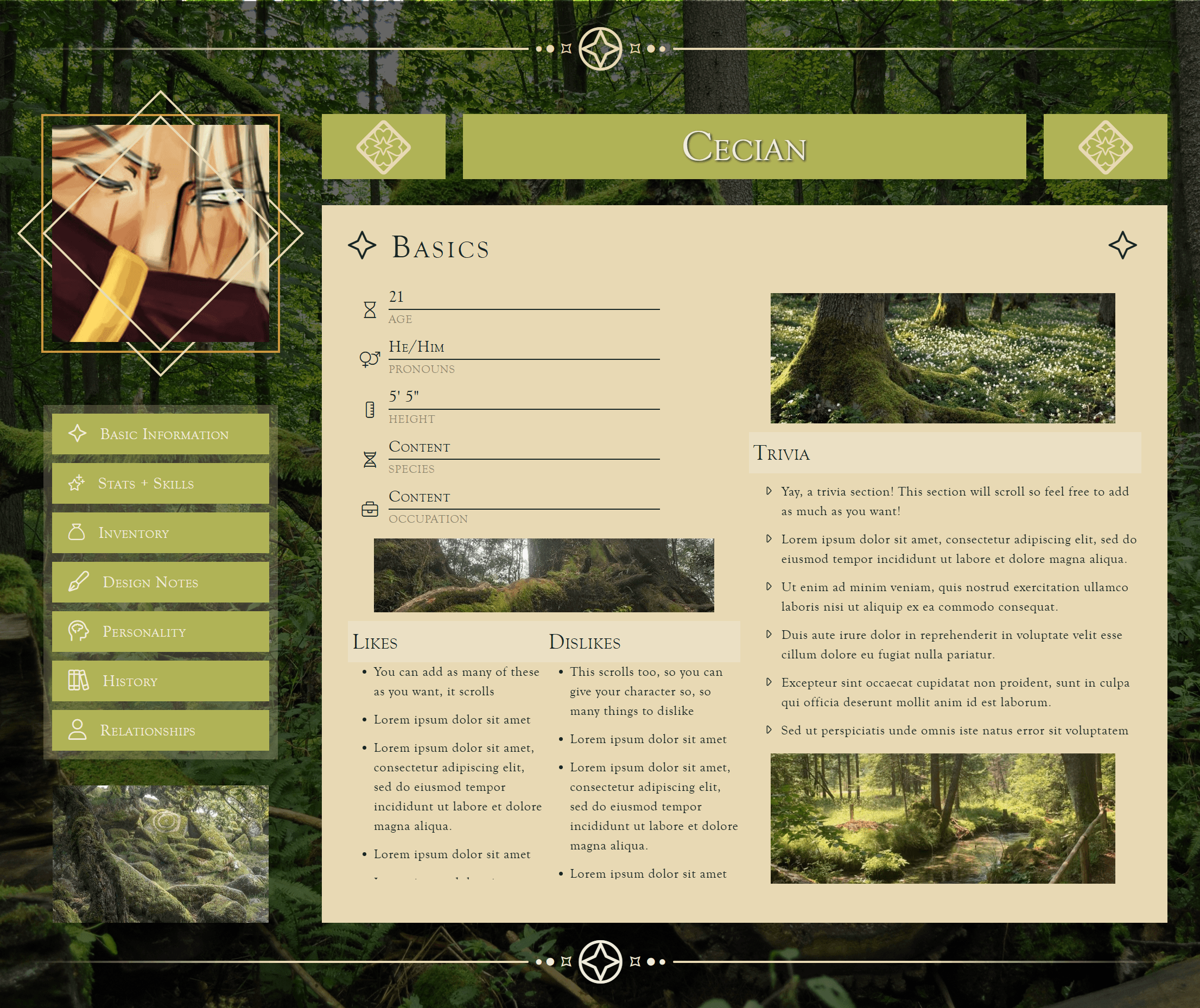
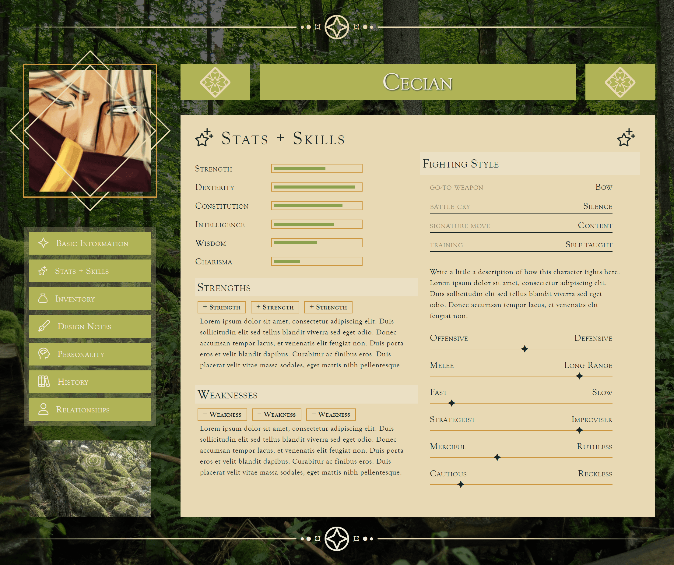
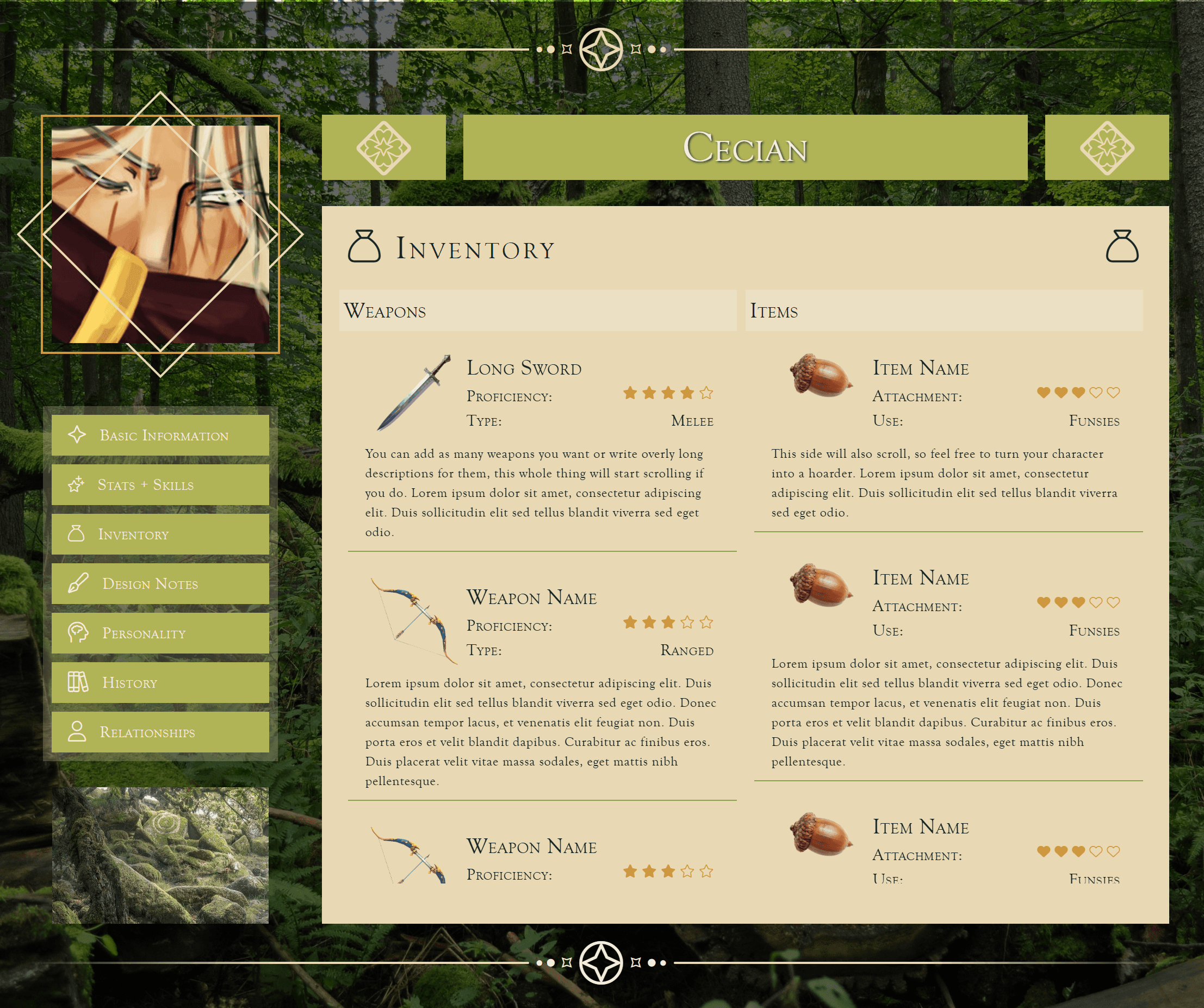
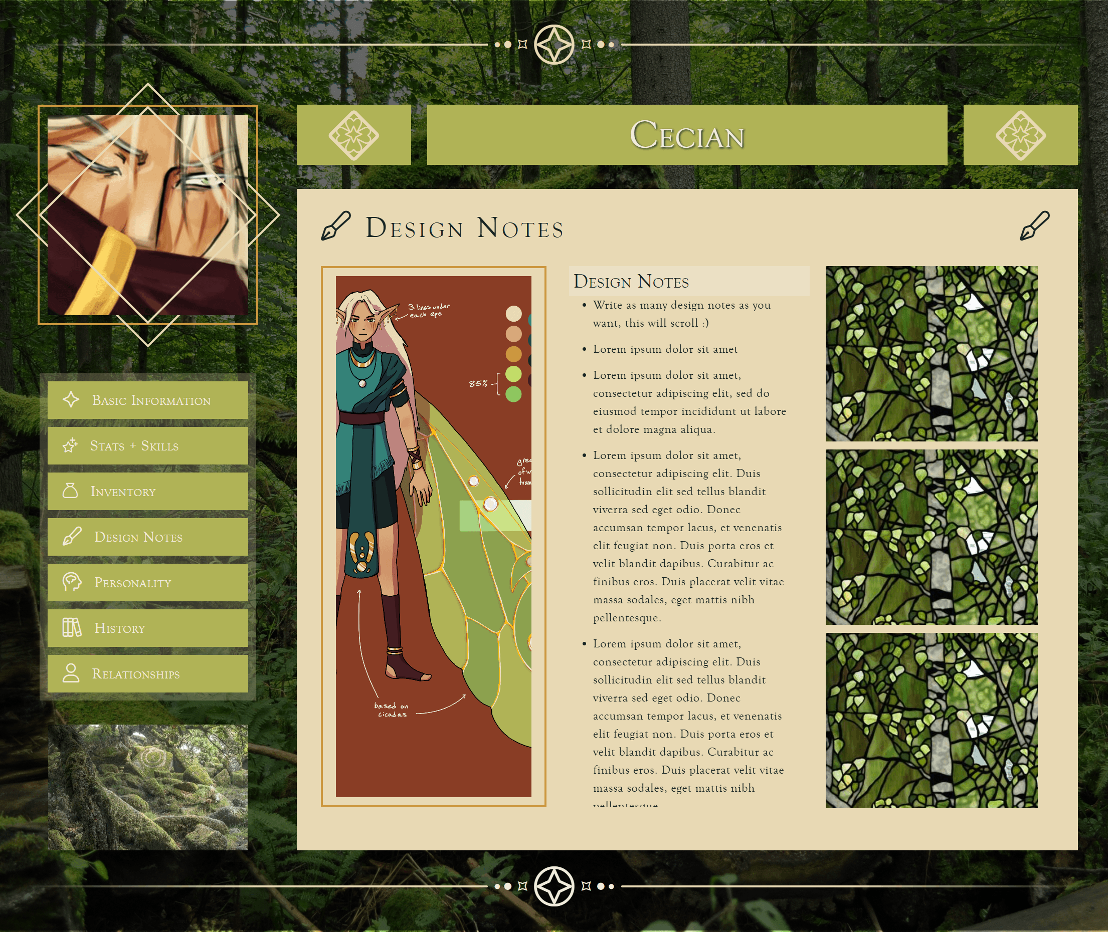
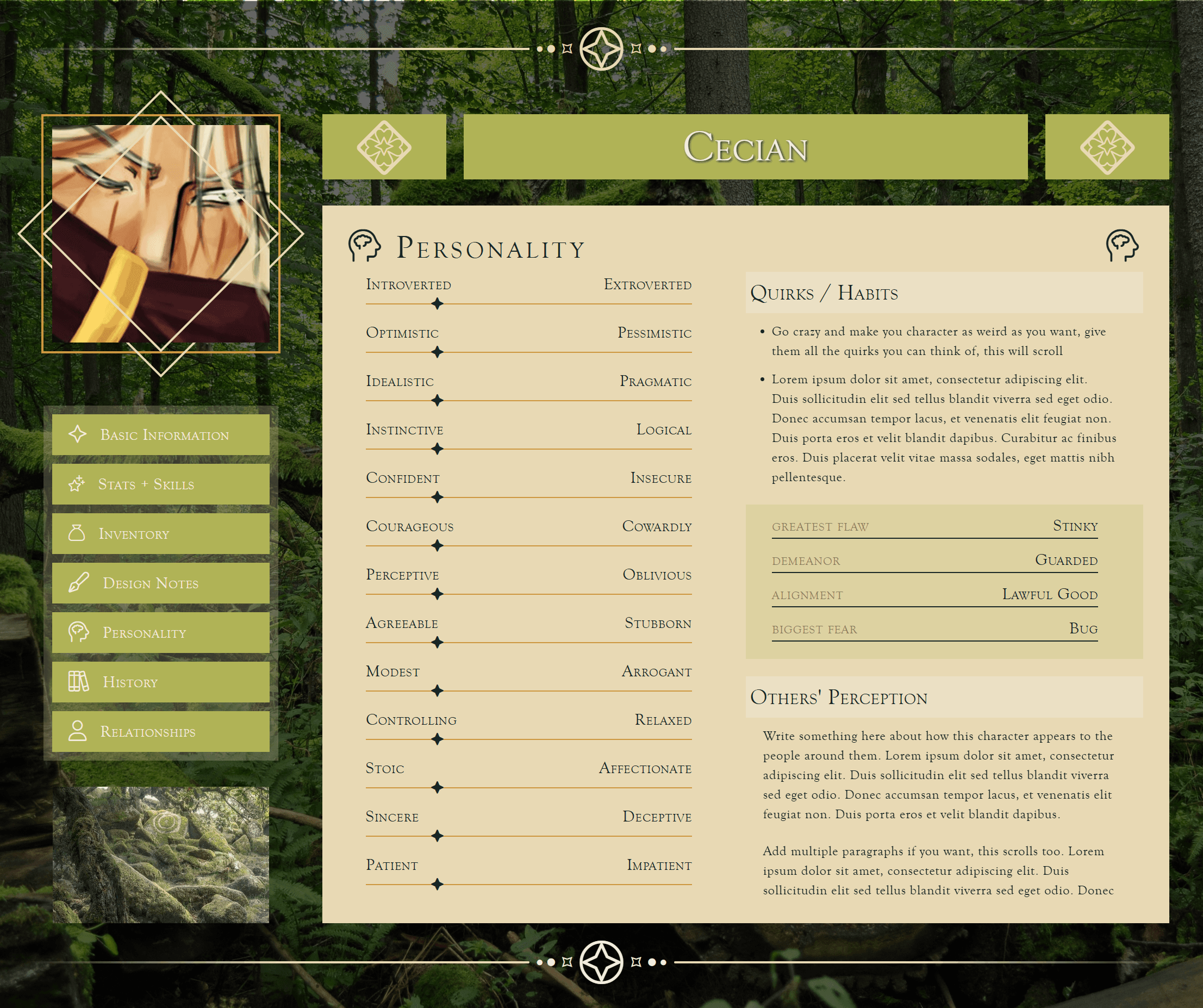
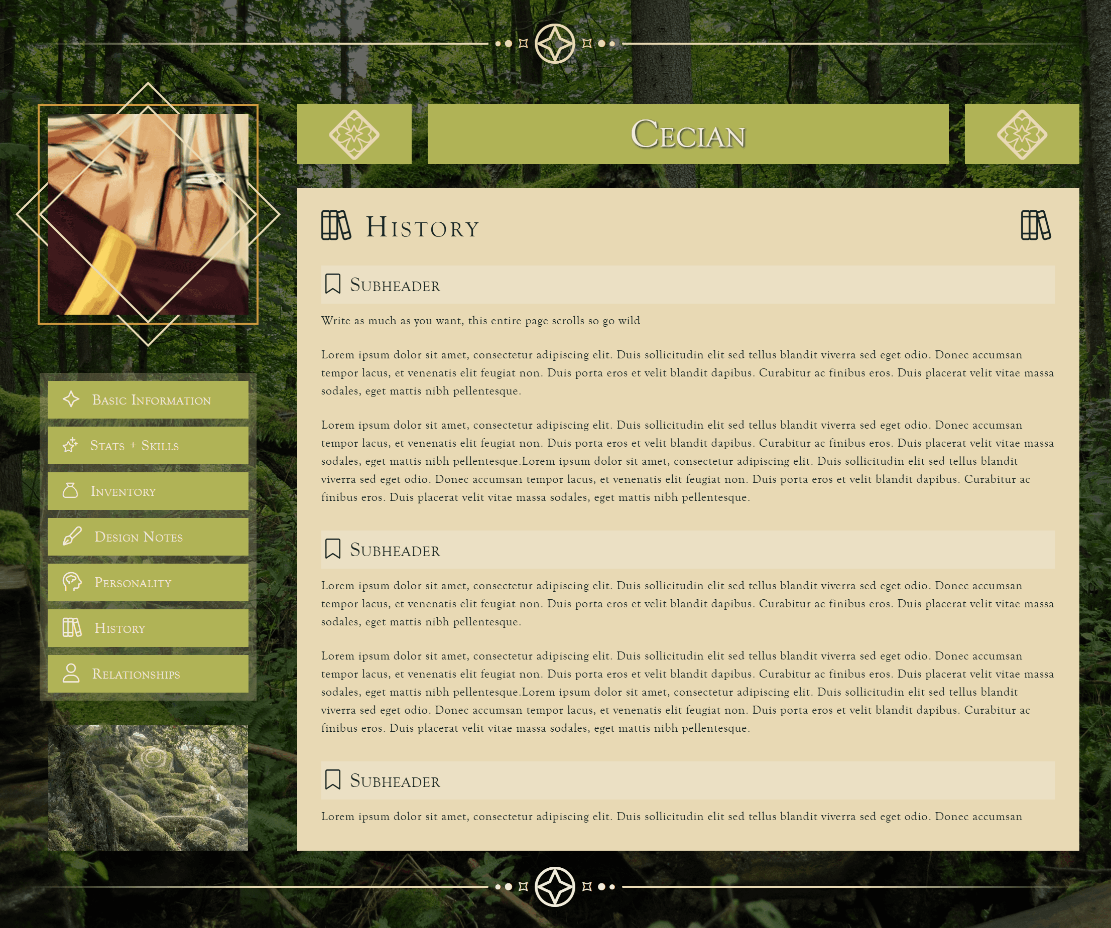
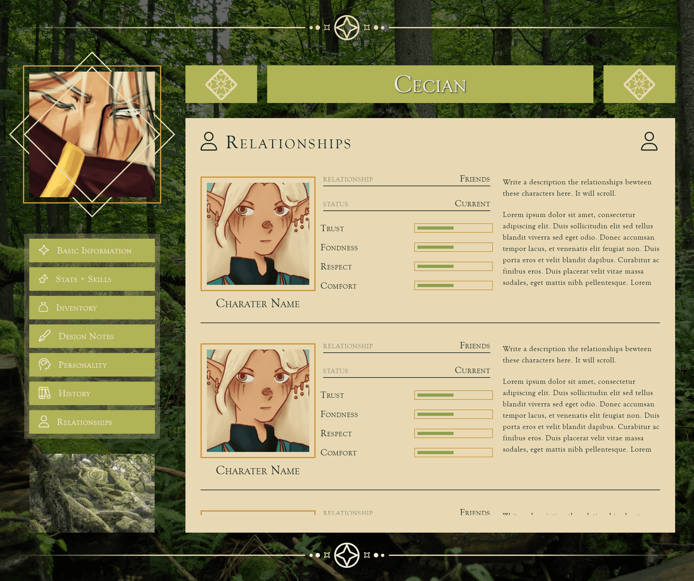
Yay! Another code! I made this one just because I couldn't find one for Cecian that I liked, hence why he is also the character featured here.
I took inspo from/referenced Sunlit Meadow by Larai for the general layout and especially the tab buttons. Go check it out, it's a pretty cool code!
This code's got a whole lot of info in it, so pretty much every little section can scroll, and there's a mini index thing at the top of the code in a comment to help you navigate it.
1471
Aug 12, 2025

Clouds
Interactive version
This was made for the CQ Prompt Pack #1, I chose the layout Stumble. This is my first time doing a coding challenge like this and it was really fun!!
I think the colors and the flow of it looks really nice. The mix of rounded and sharp corners started off accidental, but it looked so good I just went with it.
I wish I had included a design notes section, but it didn't really fit any where. Though if I were to put it somewhere, I'd probably just replace the story section (I'm bad at writing lol).
1265
Aug 18, 2025

Butterflies
Interactive version
I made this for the CQ Autumn Challenge! The goal was to make a layout where each profile section was a full width bar/block so that it's easier to remove or reorder anything without much coding knowledge. There are comments throughout the code that should help identify where each section begins and ends.
This is also the first time I've made something with Bootstrap colors, even if I gave it two accents as well... But still, there's a Bootstrap version!
When editing this code, I recommend folding/collapsing the code for the leaves/butterflies decorations, as it is pretty lengthy and annoying. There's some instructions in the code if you need help.
393
Sept 21, 2025
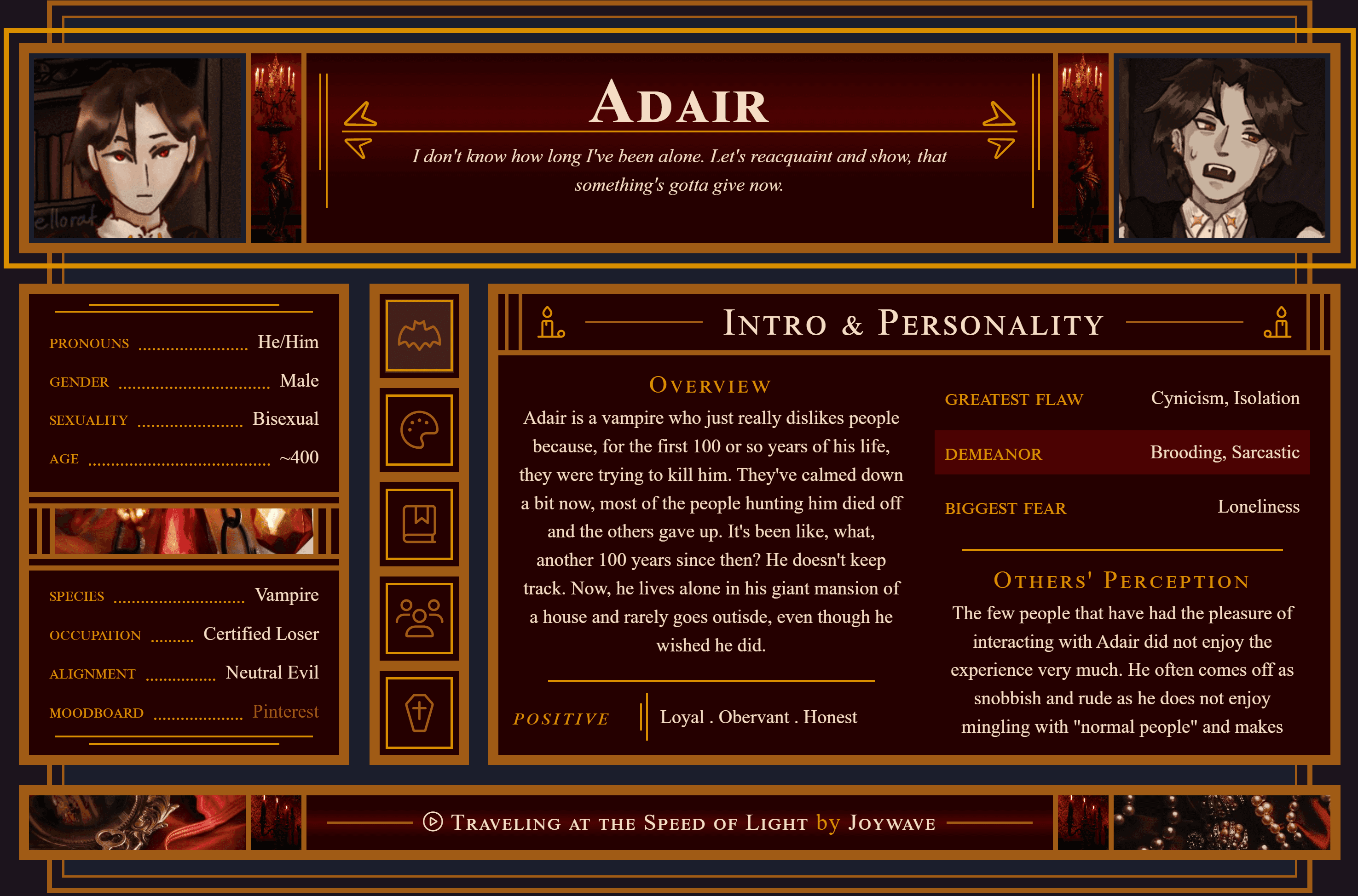
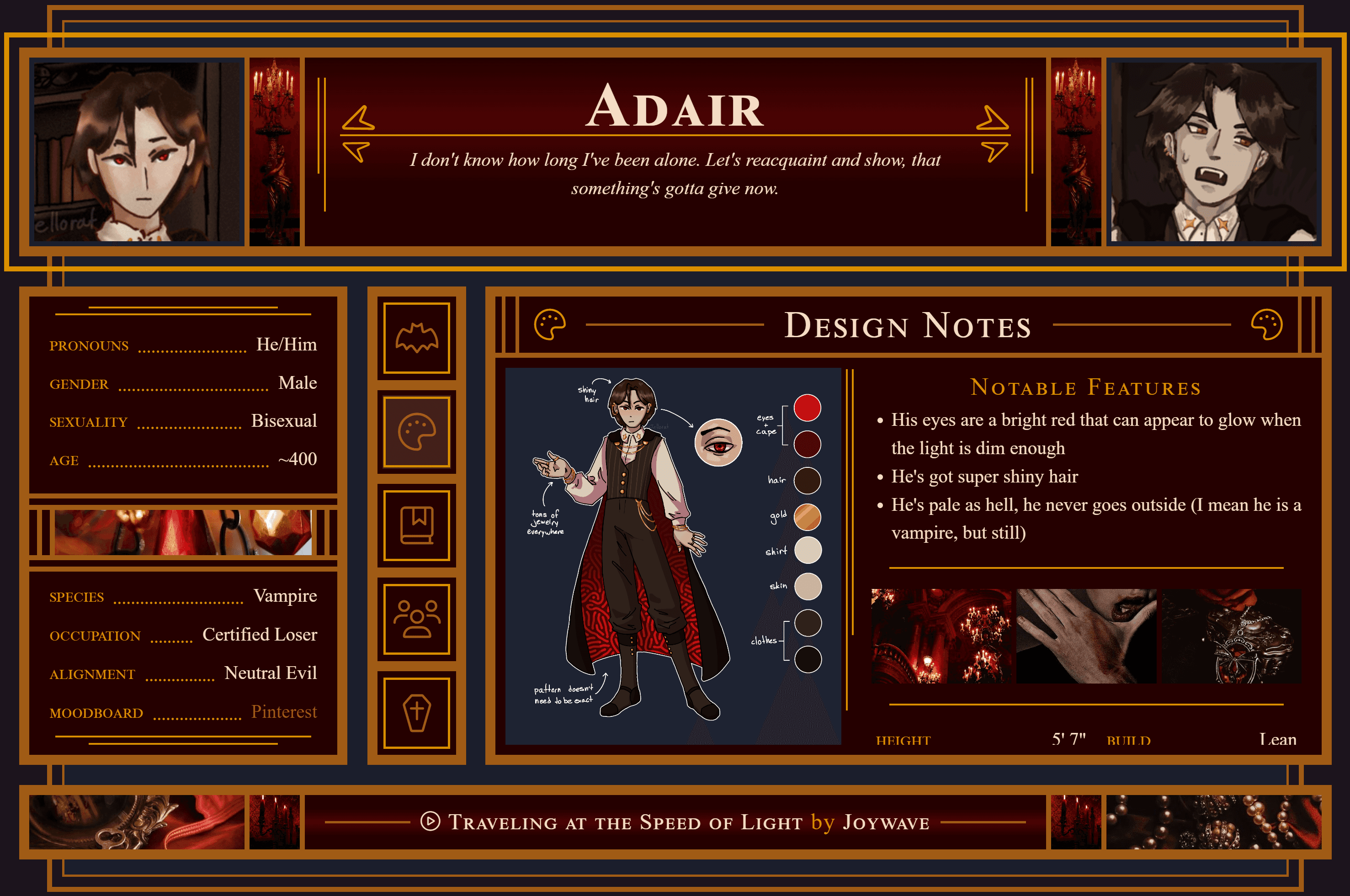
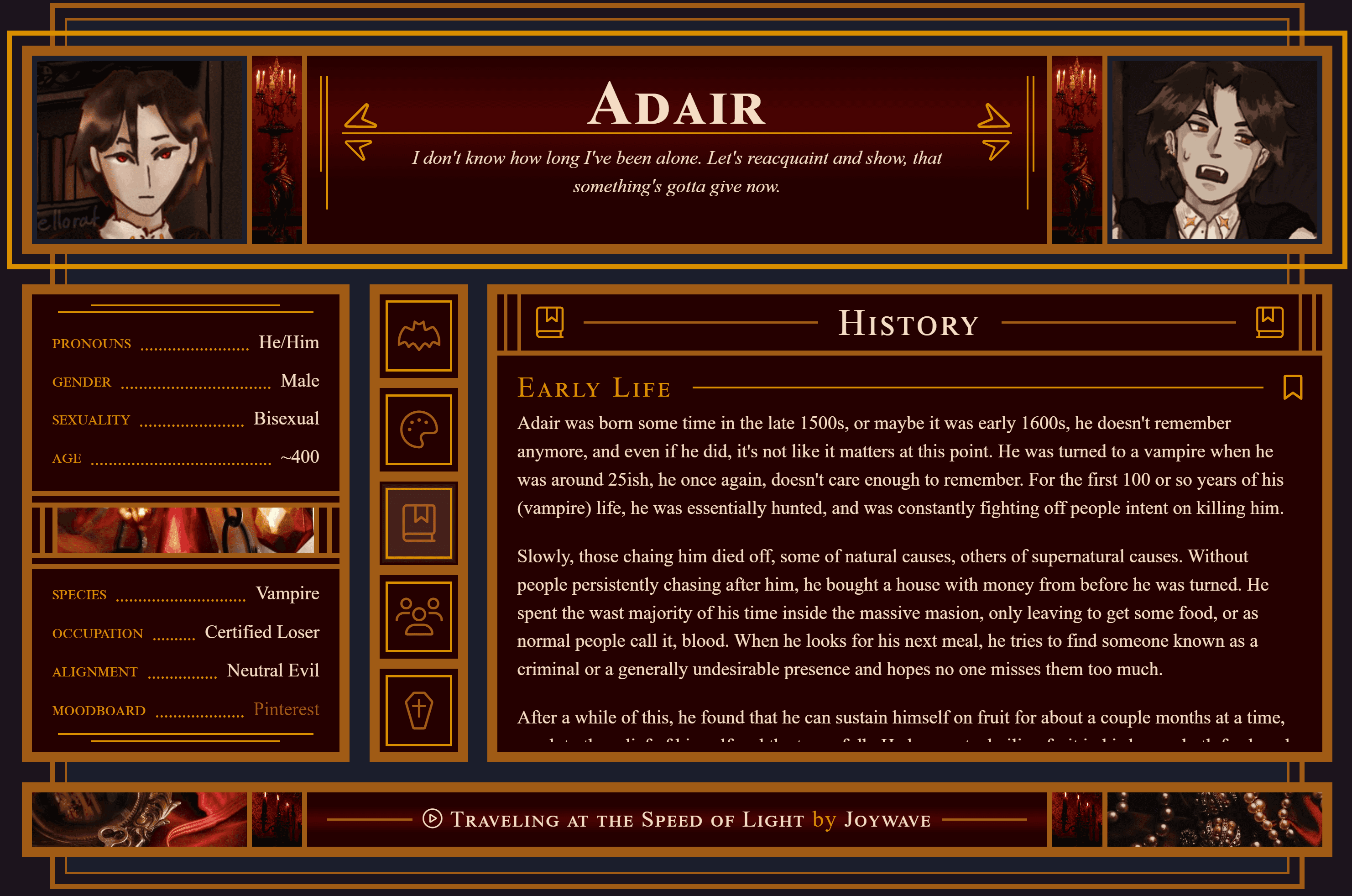
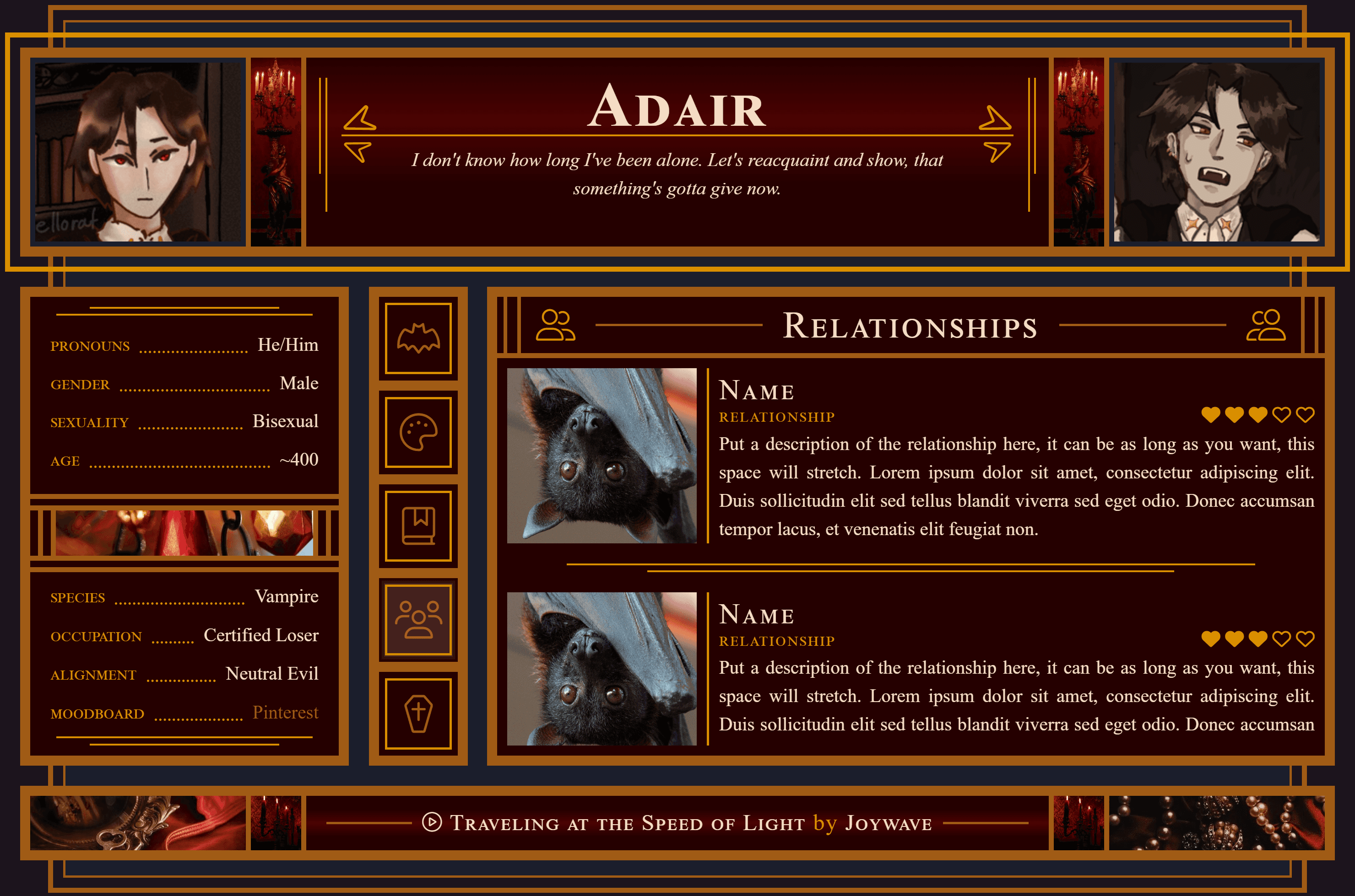
Sanguine
Interactive version
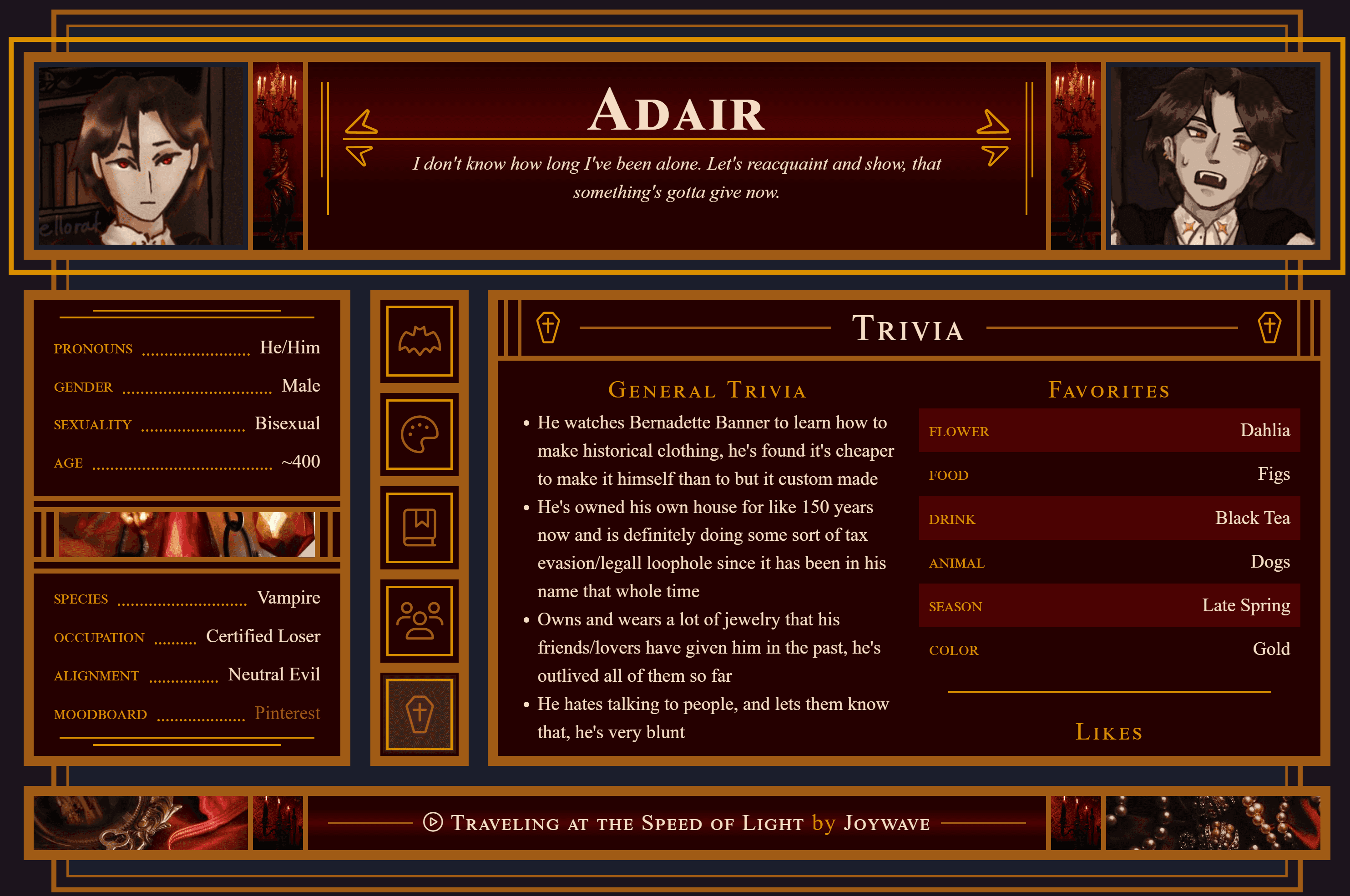
I made this because I wanted to mess around some more with overlapping elements and using lines as decoration. I think it all came out pretty well, but the design notes tab is my favorite, it just looks so nice. The overlapping-ness of this code is a bit less apparent on mobile, but it's still there a little bit.
This ended up being somewhat vampire themed (hence the title), which works well since Halloween is coming up, so I'm going to pretend it was the plan all along. Adair needed an updated profile anyway, it's a win-win.
